complete-user-onboarding-revamp-for-magister-app-2
Content Re-design for Magister App
Overview
Magister is an English learning app built to help non-English travelers learn to speak English better during social interactions.
Scope
As a UX writer, the client tasked me with going through the App to help align its UX copy with business goals to increase sign-ups.
- My role: Freelance UX writer
- Stakeholders: Client
- Timeline: 10 days
Tools used
- Figma
- Google Docs
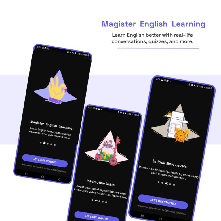
Auditing the before copy
To better understand the problem, challenges, and goals, I performed an audit on the existing UX copy.
Challenges
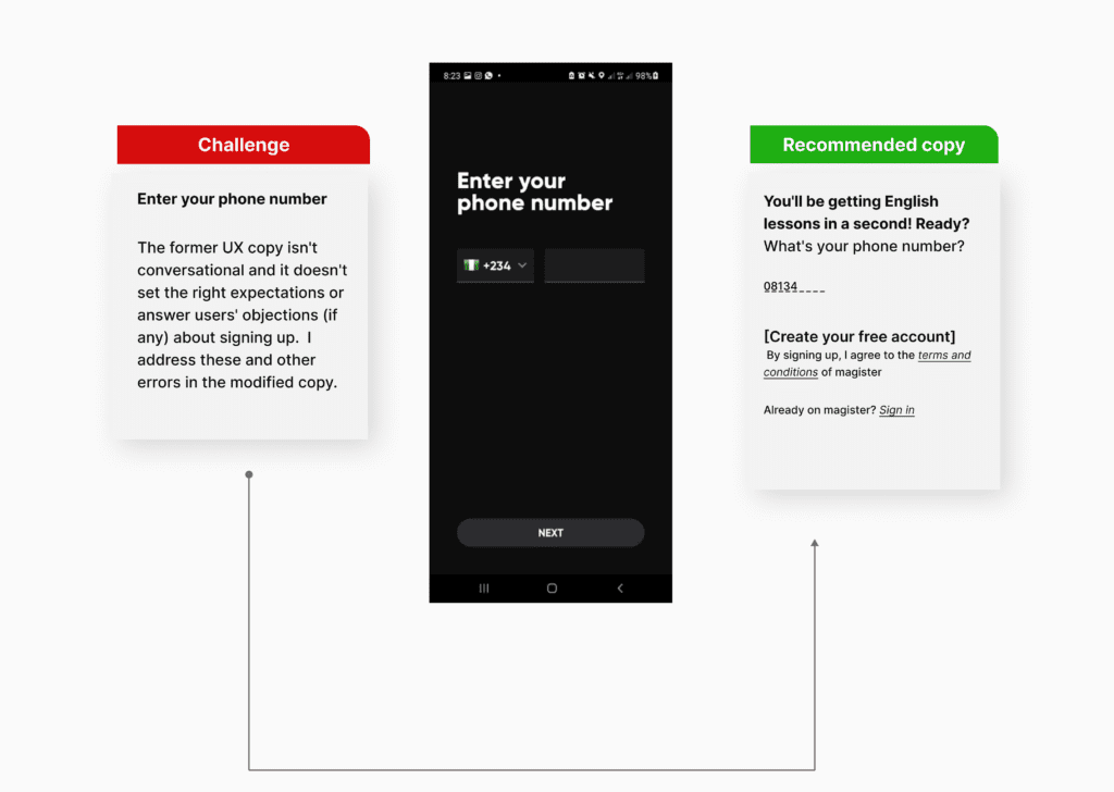
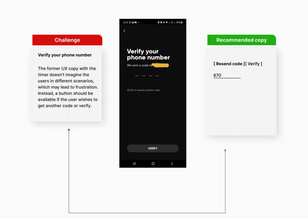
- I found sentence clusters that may delay a user from taking action due to a high cognitive load.
- They didn’t visualize progress to set the next expectations.
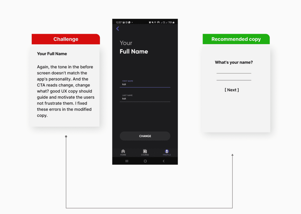
- It was difficult scanning for important information due to an inconsistent tone and voice ( lexically too ambiguous for English learners).
- The benefits did not align with the product’s USP.
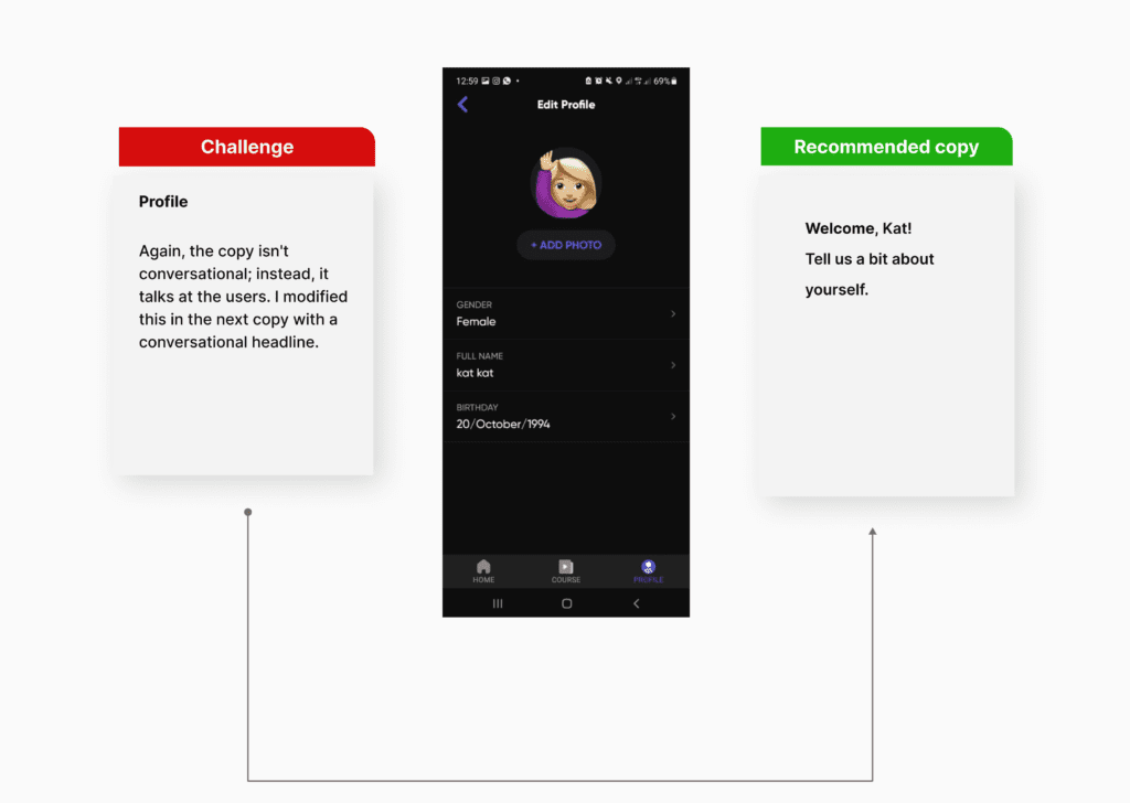
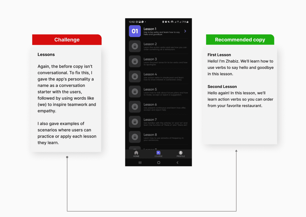
- Additionally, most of the messaging spoke at the users, not to them, which is against the principles of good UX writing; to guide users intuitively.
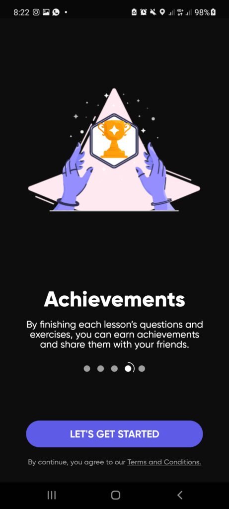
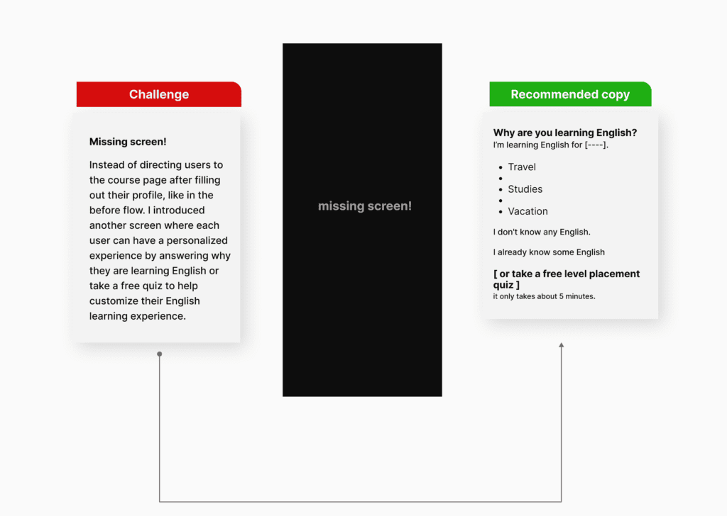
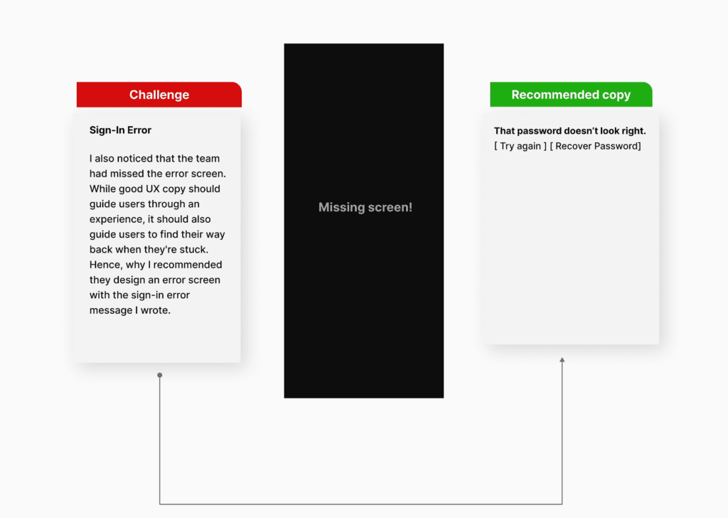
- I also noticed some missed steps (screens) in the user flow. One was the welcome screen in the user onboarding flow to set the right expectations and the sign-in error screen in case users get stuck or lose their password.
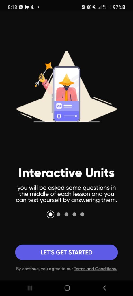
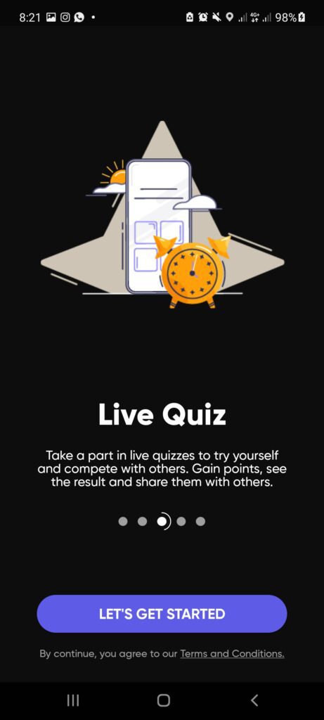
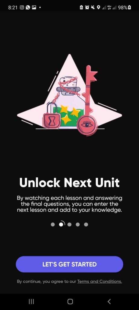
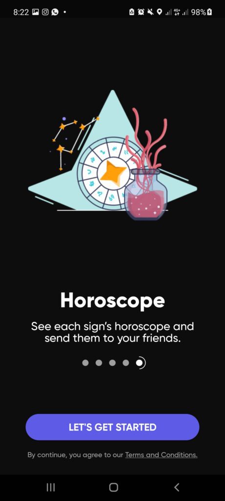
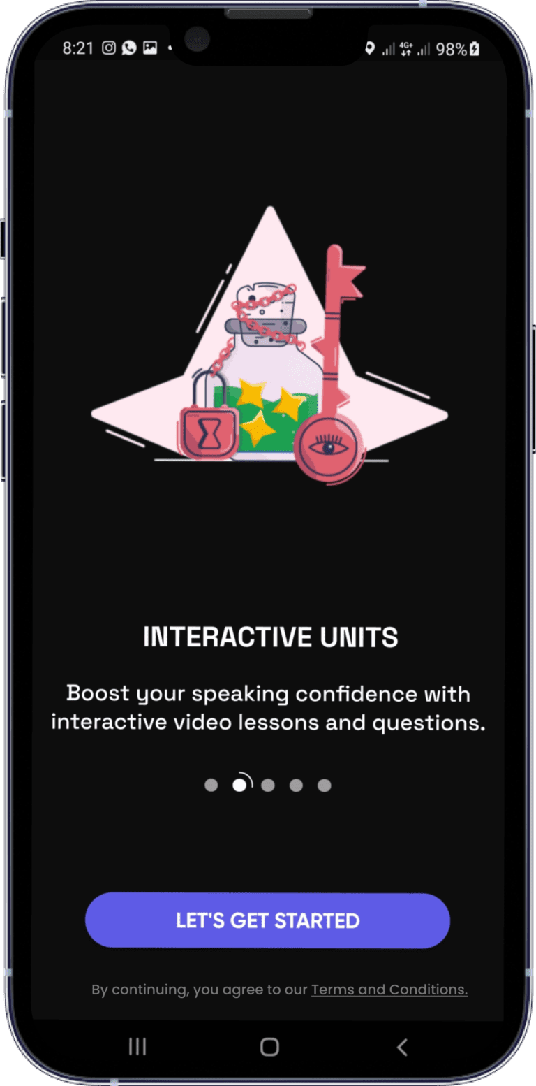
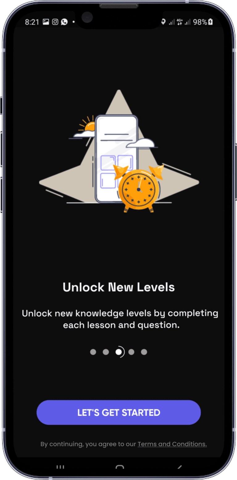
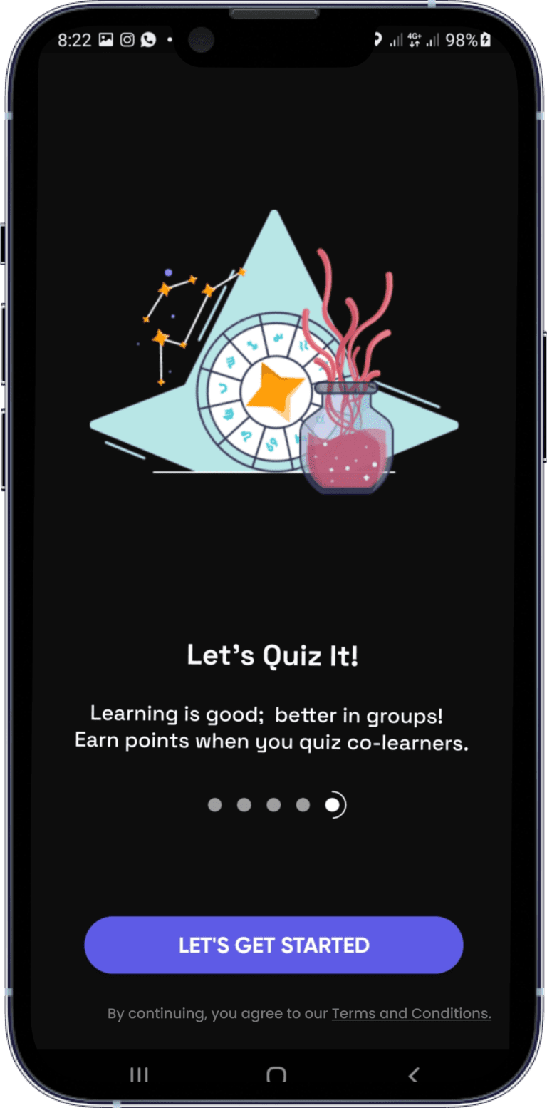
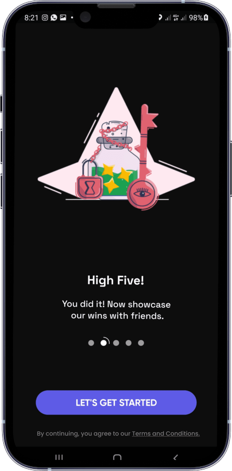
Please swipe and zoom below for my audit of the before screens.
Hypothesis
After conducting the audit, I concluded that we’d have increased sign-ups and engagements by simplifying the copy flow to focus on communicating value frictionlessly to aid understanding.
This hypothesis served as my basis for further investigations.
Conversation Mining and Validation
“People will engage in an experience that speaks their language”
While logic and research help you identify your target users, the gold is in digging deeper into their conversations. Little wonder why it’s called “conversation mining”.
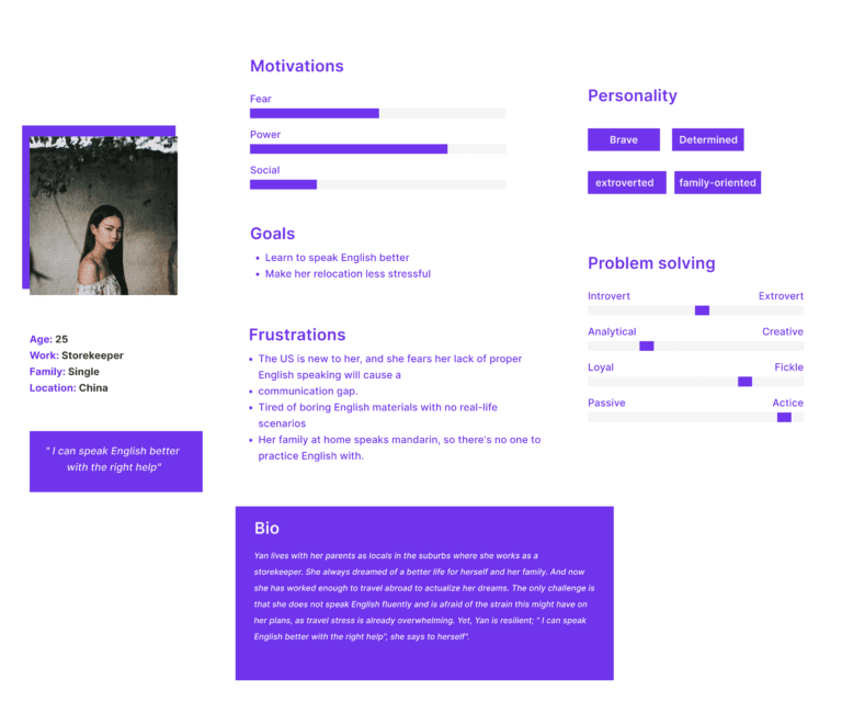
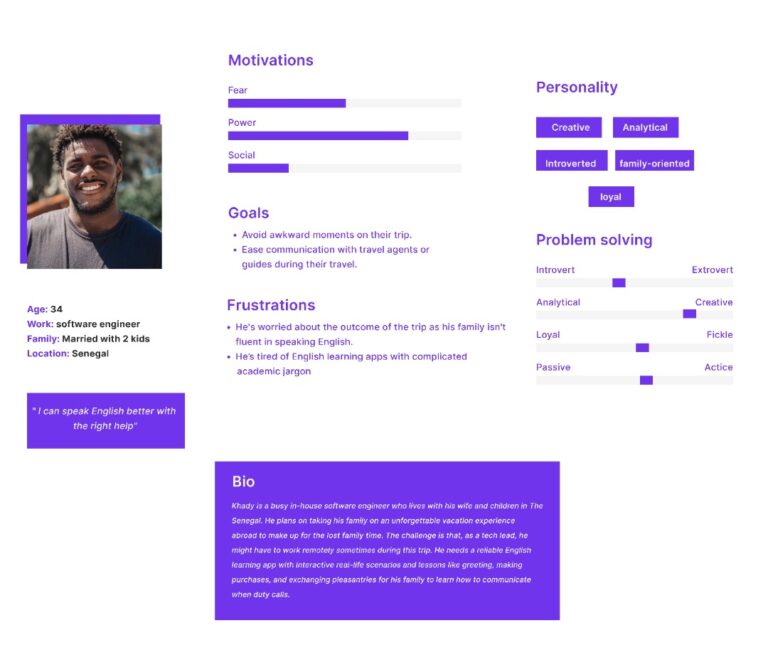
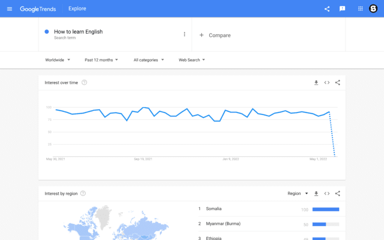
Armed with a detailed overview of the target users I researched further into publicly available resources ( app stores, social media, forums, and Google Trends to learn our users’ lingo, words with offensive connotations, or other constraints in their language.
These insights and data would later influence my writing.
Competitor Analysis
Using the 10 Usability Heuristics for User Interface Design by Nielsen Norman Group and other UX writing criteria like accessible, purposeful, conversational and clear, I further analyzed competitors’ products and reviews to look for opportunities to create a better product experience and brand positioning for Magister.
These competitors were:
- Duolingo
- Rosetta Stone
Duolingo
The world's best way to learn a language
Onboarding
- Duolingo’s onboarding flow starts with a set of personalized questions for a tailored learning experience.
- Duolingo visualized progress throughout the flow. This helps to set expectations that the user will soon complete the onboarding process.
- While I appreciated their product-led strategy in allowing users experience the app first before signing up. I was curious to understand the rationale behind this.
In my opinion, they didn’t want to sound too committal at first, but it was counter-intuitive as I kept on wondering what would happen to my initial learning progress since I didn’t create an account. This makes a case for using familiar UI patterns to reduce cognitive strain.
Well, let’s see what happens next.
I became fascinated with the gamification they employed to motivate users to answer questions and receive rewards. So, I began to play.
Ongoing use
Break in the user flow
It didn’t take long for my wins to be cut, as I couldn’t stop worrying about losing my progress/rewards.
Remember, there was no option to create an account during onboarding.
So, out of curiosity, I clicked the back button to find out.
this is my attempt to mimic the notification I received after clicking exit
[ Are you sure about that?
All progress in this lesson will be lost.
Cancel – Quit ]
- Use of double negatives
I felt more cognitive stress trying to decide on the right button to click to save my progress between; cancel or quit? – A real dilemma.
Fun fact: “What do you want to eat” is the only dilemma I love experiencing.
True fact: Messages with double negatives increase cognitive load as users spend more time deciphering them.
Update:
About the “no sign up” option. I read a study that claims the team at Duolingo purposely delays signup for users to boost the number of daily active users. I’m still on the look for the impact of this particular strategy on other people and won’t hesitate to share my findings.
Rosetta Stone
The Experts in Language Learning
Onboarding
- Rosetta Stone’s onboarding flow was straight to the point, sign up, etc.
- They provided account set-up options.
- They didn’t visualize progress throughout the flow.
- There were no gamification elements to nudge or engage users.
- They presented subscription options before delivering value. The team at Rosetta Stone isn’t using a product-led growth strategy. Product-led growth is prioritizing product experience by letting users experience the product first. before asking for commitment.
Besides, presenting subscription options before the onboarding process may disturb the users’ flow, as it did mine. Besides, how would users differentiate between the three tiers of subscription plans without experiencing the product?
Good UX copy should reduce a user’s time deciding on an action.
Ongoing use
Overall, I found it satisfying that their learning experience included real-life scenarios like travel.
Competitor Analysis Takeaway
I saw three opportunities to improve upon Magister’s onboarding and in-app flows:
- Inspire users by setting the right expectations and disclosing value progressively.
- Reduce cognitive load on users as much as possible by anticipating and addressing their needs and questions at the right time.
- Provide value first before asking for commitment.
Product Voice and Tone
To develop the product voice, I used the product principles as a foundation and other aspects of voice; concepts, vocabulary, verbosity, grammar, punctuation, and capitalization as a guide.
These principles served as my basis for developing the product’s unique characteristics into a voice with a recognizable, consistent, and distinct personality.
For a consistent tone, I used my knowledge of the four dimensions of tone to create a tone spectrum that caters to each point of the user’s journey per time while maintaining a consistent voice.
Magister is:
Accessible: Magister understands that its users are not English native speakers. So, we teach English in a friendly and conversational way using everyday language they will likely encounter in real-life situations without the jargon of academic-level English.
Efficient: Magister understands its users are either tourists looking to explore a new country on vacation or immigrants looking to relocate permanently; either way, Magister understands this process can be stressful; hence lessons are delivered in a fast, secure, and reassuring manner.
Approach
Using my findings combined with the three principles of UX copy, clear, concise, and useful, I removed unnecessary lengthy words that weren’t useful.
With my knowledge of users’ F – shaped pattern of reading eye-tracking research, I focused on front-loading the copy with exciting benefits while setting the right expectations using progressive screen disclosure for a less cognitive load.
Content Testing
When users achieve their goals, it’s a win-win for everyone. So, I took a step further to perform readability and comprehensive usability testing to validate my copy.
- For readability: I aimed for the Flesch Kincaid grade level of 8, which is adequate for 85% of the public to understand easily without reaching for a dictionary.
- For comprehension: I performed the cloze test, whereby I replaced every sixth word with a blank to see if testers could predict the following word in the copy to grasp the main context.
Outcomes
The tests proved the words indeed were clear enough and easy to navigate.
The client was pleased with my ability to point out the errors in the former flow and overlap business and users’ goals for an increased sign-up rate and easy onboarding.
While the definition of successful content may differ depending on marketing objectives, I plan to measure metrics through Google’s UX HEART framework:
- Happiness
- Engagement – shares, reviews, etc
- Adoption
- Retention
- Task success
Others:
- Traffic & repeat traffic
- Number of signups
- Call to action – Inquiries, conversions, etc.
What I Learned?
Sustainable copy ( early introduction, constant iteration, and optimization) is essential during the life cycle of a product.
My Challenges?
Teams are still embracing UX writing as an actual role; hence some of our jobs come at the last stage of development or when an experience is “broken.” Or, as Torrey Podmajersky – author of strategic writing for UX, rightly put it, “we need to hire someone to fix the words!”
The same holds true for this project. I was brought in during the product’s final stage of development, giving me no prior data to work with from the UX researcher and designer.
However, that didn’t stop me from asking constructive client questions, which was a good basis for approaching the project.
My vast expertise in user research, content strategy, and UX writing for the final UX copy came in handy for me to successfully overlap both users and company goals.
I also gave recommendations and actionable next steps.
What I’d do Differently Next Time?
Introducing content earlier would have been great for collaborative teamwork.
My Recommendations
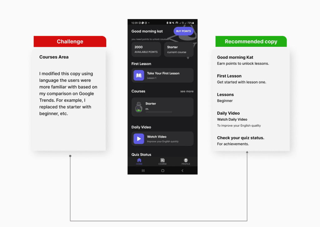
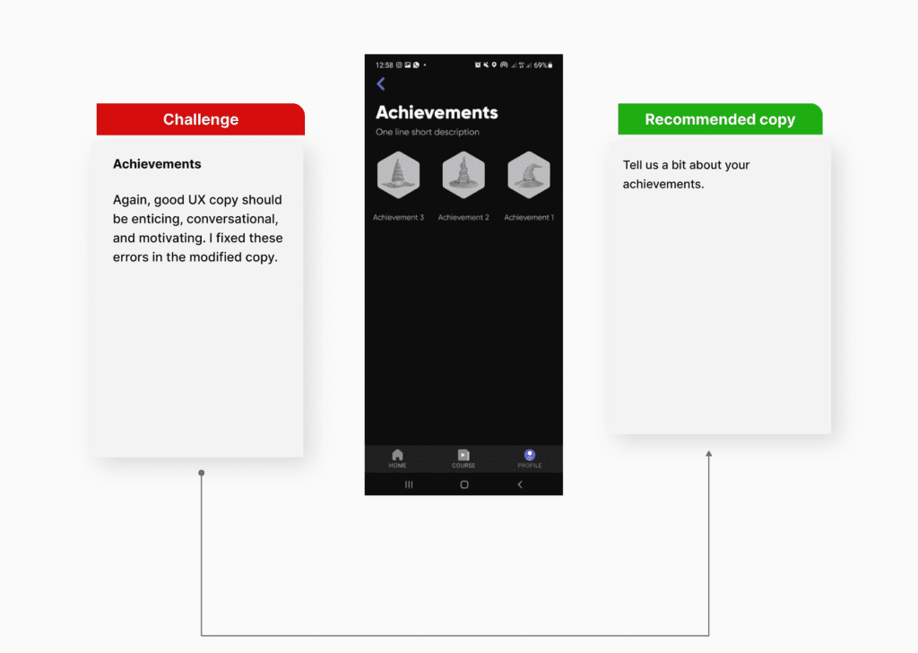
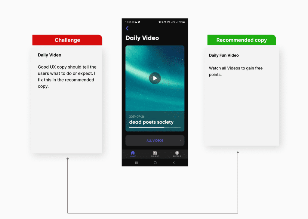
Based on competitors audit and content testing, I made recommendations for the in-app experience.
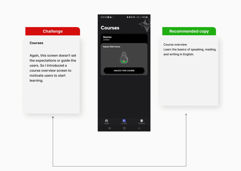
I realized asking users to buy a point without prior knowledge of what the lessons contain was too committal for first-timers.
So, I suggested adding a free trial to nudge users to take action with a sense of safety.
I suggested adding a feature to visualize progress as a way to send the users feedback on actions. This would eliminate guesses and prompt them to complete tasks faster.


