SEO / UX copywriting for St Cleve Photography Website
Overview:
St Cleve is a Florida-based photographer rendering wedding and engagement photography services.
Scope:
SEO and UX Copywriting for home page, about us, services, and portfolio.
My role: SEO + UX copywriter
Stakeholders:
Client – Stclerv
Goal:
To revamp St Clerv’s wedding photography website, clarify its messaging, and increase its discoverability and users’ experience through SEO copywriting and UX writing.
Debriefing the Brand
Brand Values
I was off to a good start with an initial Q and A session with the CEO to get a sense of the values he resonates with.
Which he listed as faith, family, and love.
To validate these values, I cross-examined them with the 116 Brand Values list from Microcopy: The Complete Guide, and they all appeared as core brand values, so we were good.
These would later assist in defining the brand’s personality.
Voice and tone
The founder wanted to maintain the brand’s existing voice and tone, which he listed as Genuine, Classic, and Confident.
Identifying the Big Idea
“ big ideas are the key to successful written content.”
A big idea is a unique, core idea that you focus on in a piece of copy, which is both interesting and beneficial for your reader.
To find the big idea I:
- Identified the main problem St Clerv solves.
- Analyzed all the unique selling points provided to see what would tick the audience the most.
- Advanced to product research to see if there are secondary unique selling points the brief didn’t cover.
Weirder than fun fact:
I always approach every project the good ol way, you know; paper and pen style.
After this session, I was able to craft out St Clerv’s USPs as:
- Timely
- Storytelling
- Timeless
- Customizable
Product Research
“Features tell, benefits sell.”
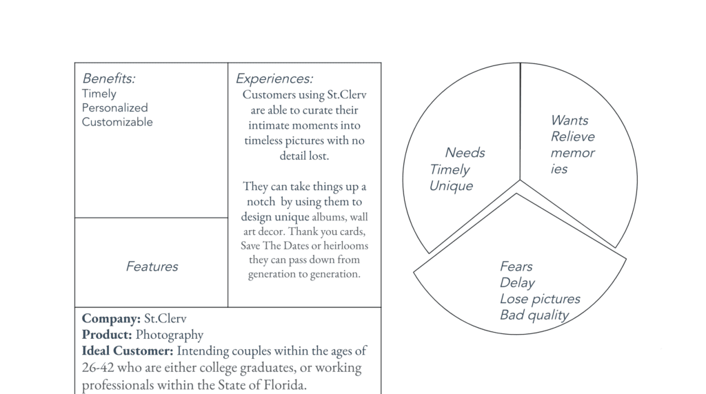
Next, I researched further to understand the product’s features and how they may provide emotional benefits to the users/customers.
After which, I transformed them into relatable emotional benefits using a feature-to-benefit exercise by answering questions like:
- Why is this feature notable?
- What problem does it solve?
- What is the core pain point that this problem creates?
- When does this matter the most?
- Why would the customer need this?
After this session, I fleshed out the emotional benefits of each feature St Clerv offers.
User Insights
- Age: 26-42
- Gender male and females
- Socioeconomic status: People with steady careers or disposable income who can afford the comparatively premium price
- Profession: College graduates, working professionals
- Location: Florida
- Values: quality, traveling, family, faith, and customer service.
Customer Avatar Profiling
To further understand our costumers I conducted research focused on building a fictitious persona of the target customer: their current challenges, pain points, motivations, and goals.
The insights served as my basis for researching publicly available resources ( wedding forums such as wedding wire, hitched. co), social media, Quora, and Google Trends to learn about their frustrations and objections in their language.
Conversation Mining
I collected conversations, opinions, and reviews from our target customers as they conversed about their wedding photography experiences. This helped me gain a deeper understanding of their fears, desires, and needs.
User Goals
- Feeling confident in their chosen wedding photographer
- on-time delivery
- High-quality pictures
- Comfort
- Responsive customer service
- Reliable customer reviews/photos
- Timely delivery
User Fears
- Delay in delivery or losing photographs
- Not getting their money’s worth
- Feeling lied to or ripped off
- Receiving bad quality photos
- Bad customer service
After in-depth research on the target audience and understanding their real pain points, I learned that one of the biggest worries for the target audience is the fear and worry of disappointing photography experiences. Being a problem-aware audience, they know of these problems and have a lot of objections, but still, they can’t do without the service. This means they would be willing to patronize a photography service that addresses these objections.
Compare and Contrast
After understanding the customer’s pain points and motivations, I returned to my drawing board to cross-examine which unique selling points would benefit the customer most.
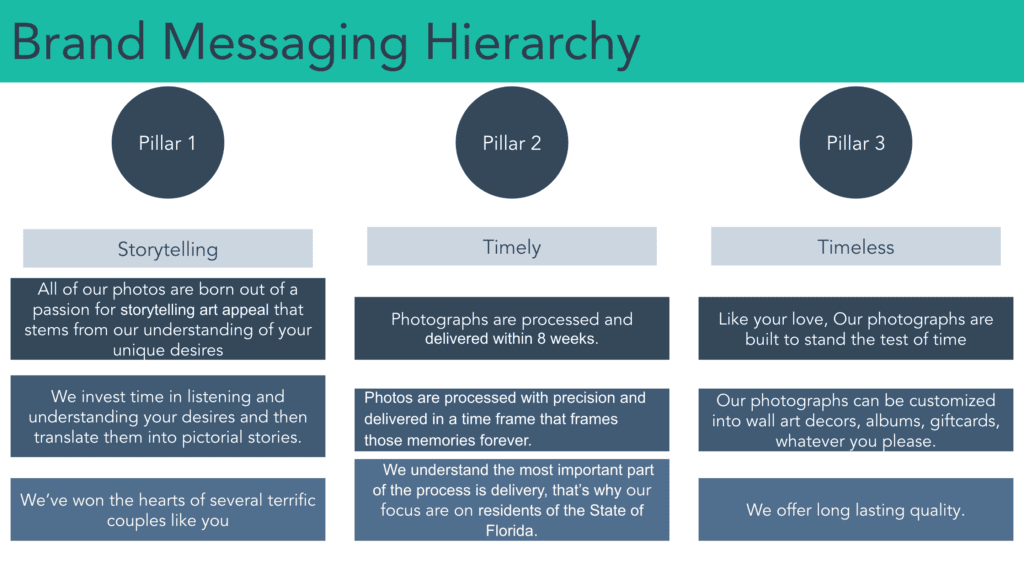
Based on these insights, I leveraged Timely, Storytelling, and Timeless as the three brand pillars to build a relatable message with the customers.
Revamping the Tagline
Original copy: You dream. We listen. We execute.
Problem: This tagline is vague and misguiding. Also, it doesn’t target the right audience or feature the company’s vision or mission. A good tagline should be ultra-specific while showcasing the brand’s USP.
Keywords: storytelling, timely, timeless, memories, artistic, quality, dreamy, high quality, artistic, unique, modern.
Revamping the Mission Statement
Former: I am on a mission to change the way people think about photographs and to help them realize that photographs stand the test of time.
Revised
Competitor Analysis
For a unique brand positioning, I conducted a competitor analysis to identify industry trends, what differentiates St Clerv from the rest in terms of content hierarchy, and other opportunities to position St Clerv better.
Direct competitors:
I analyzed and compiled information based on 3 dimensions:
- Product: Products, features & offers.
- Branding, colors & imagery: Different brands utilize video, animations, and short clips.
- Messaging: While some brands did point out key features through images or videos, they didn’t consider the different stages of the user’s journey, i.e., awareness, consideration, and decision.
They addressed their audience as hot leads ( people who know or have used their services before).
Hence, their messaging didn’t set clear expectations and proper indoctrination to onboard new customers.
Take aways
After finalizing the competitor’s analysis I concluded that to sound unique and inclusive I needed to ensure that St Clerv’s messaging put into consideration the user’s journey and sets the right expectations throughout its copy
Bringing it all together
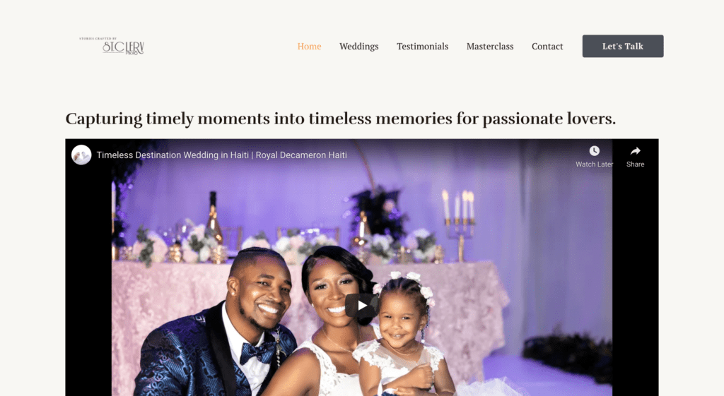
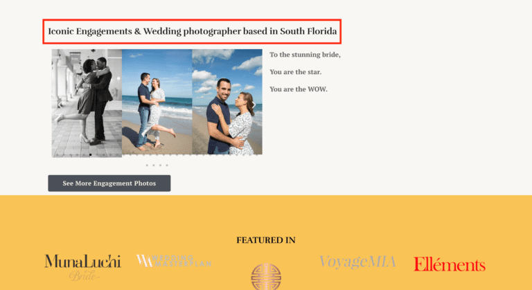
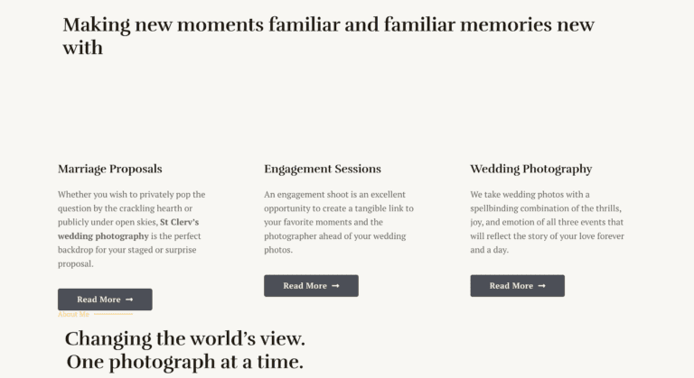
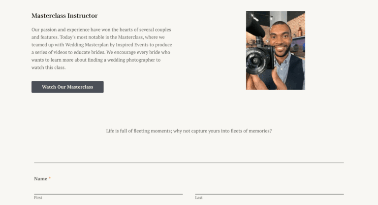
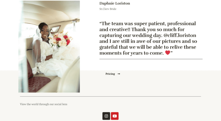
For unknown reasons, the client placed the new copy on his former home page layout ( I’m guessing as a placeholder till the new page and copy are designed).
Meanwhile, you can view the home page copy on google docs with exemptions to others yet to be designed due to NDA.
Other pages:
- For the about page, I opened with a line that immediately showed we understood the customer’s needs.
- Defined product benefits, added social proof, and changed the hero section of the home page.
- Incorporated the About Us with a mission statement, bio-focused story, and brand values to build authority.
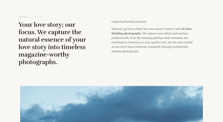
- Created a relatable story-driven service page and authority portfolio page.
- Incorporated clear headlines and sub-pairs.
- Added Clear and compelling CTAs throughout the website, where there was just text.
